Sunday, March 18, 2018

Book Covers in High School Digital Art

My high school students have been learning about jobs that are available to graphic designers, as well as Design trends.  We talk about what a designers has to do in order to complete a commission or an order and the importance of following directions, and how that will effect the approval of potential clients. 

This assignment is very open ended all the have to do is make sure that they are creating a book cover that is at least the measurements below.
 
The student get to choose there own book or make one up, and they are supposed to make a cover for it. 

Assignment:
- choose or make up a book 
- using a design trend example create cover that visually matches the story inside
- the book must have a back cover that is either part of the illustration, a synopsis, or critical review of the book 
- the book must have a binging with the title and authors name on it 
- the book must show visual consistency across both covers 
- must fill the size limitations 

A lot of the students decided to make up their own book cover, and the best part about this assignment was by far the critique. I never realized the amazing stories going on in this group of students heads. By the end of the class period I was just so sad these books didn't exist in real life because of the amazing stories the kids described. 

Our critique conversation starters:
- Describe how your book cover relates to the story of your book? 
- What design trend did you use, and did it help illustrate your story?

As far as lessons goes the results of this one get a 10 out of 10. I hope this was sign that we tapped into some sort of well of creativity, and that it shows good news for the rest of the projects this year. 


Here are a few student examples and the top three I have written in what story the students came up with for their cover. 

This made up book is about a girl who goes into a coma, and while she is under her family tells her all these secrets. When she wakes up, some how she has been able to remember everything they told her and now she has to find out what was true. 


I would highly suggest reading the back of this book jacket!


This was book this student decided should have been written by James Patterson, and it is about a girl who falls into the ocean in an accident and loses all her memory, and only when she goes back to the sea does she remember her life, but as she regains her memory she doesn't really like what she finds.


Monday, March 12, 2018

Digital drawing and painting: Drawing a State of mind.

My Digital drawing and painting class has been learning the basics of drawing on the computer. Up to thins point, it has been very structured. I would give them a specific assignment and they had to complete it with in a certain amount of time, but near the end of the semester I decided it was time to push them into the deep end.

But first : A lot of these students came into this class with little to no experience drawing on computers, and a few others came with the belief that they couldnt even draw  IRL, so taking on conceptualism at this point was pretty exciting.

The assignment:
1. Choose a state of mind
     - think beyond the surface.
Don't just pick sadness, try to identify the source of the sadness. Create a nuanced emotion that is hard to put into words. (It may also be depression, religious devotion, or anxiety)
2. Then imagine what that state of mind would look like,
- do not represent it with any words, only you imagery.
3. Sketch it out first and take notes on what each element stands for.
4. Using any of the programs draw out and create your final


The students loved the freedom it gave them, and some of them even thought of it as a therapeutic experience.

I gotta tell ya, they were hyper focused during this project,  you could hear a pin drop every day. And I have to say as a teacher, seeing that level of engagement was awesome!


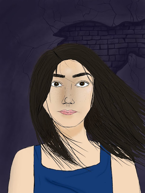
Here is some of their finished work. 
Can you figure out their state of mind?

Friday, March 9, 2018

Design Trends of 2018

Ok so I know we are already half way through the second month of the new year, so this is a little late. But I am finally ready to talk about 2018 design trends. 
First I have watched a lot of videos of design trends, but I thought this one below was the most thorough. Soooo... enjoy


I also put together a most condensed design elements list that I saw pretty consistently across all articles. 


1. Bright colors and gradient
This was abig one last year/ But it seems this year the color will be brighter, and now we are adding a gradient into the mix. So break out those neons people!


2. Color Channel (in photos and text)

3. 3D graphics

The flat life is over all hail the 3D design. 


4. Bold Handwritten fonts
2018 wants everything to look handmade apparently. 

5. Unconventional color combinations

We have seen the complementary and secondary color combos in years past, well now its time to see something new. The color combos you wouldn't think would jive are making a splash. 

7. Custom illustrations 


8. Geometric shapes 

They are back people!! And they don't seem to be slowing down. 


9. Digital and photo integration 

Also adding too this, while using the original photo, designers are bring down the detail to its most simple form, creating an icon of sorts.


10. Design and text integration 

Apparently the world wants to live in the digital... or at least get to see what that would look like. Because the integration seems to be every where


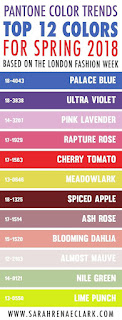
Addendum: Color of the year!

Every year Pantone comes out with a color and every year I think, "Really?!" and then half way through the year its to only color I see or want to see.