Wednesday, May 23, 2018

Macro Photo Lesson in High School


Macro Photography in the spring in Minnesota, might be my new favorite lesson for theses reasons:
1. They go outside and experience nature
2. The photos are all of happy spring time things that are brief and beautiful 
3. The students get out of the classroom and some fresh air, putting them in a good mood. 
4. They took such good pictures!!
5. They tried out a ton of new angle and techne
My lesson: 
- First day we learned about things to look for that would make good macro photos

- Second day we went outside on a walking lesson adventure and I showed them how changing the angle or perspective will force the viewer to see things in a new way, making their images more unique. 

- Third day we learned about Lightroom(which is where they did all their editing for this project). We  have used Lightroom before so I tried to find areas of the program I was confident they had not used yet. 

Then they had work time. 

Their Assignment:
1. Take 10 photos demonstrating your understanding of Macro Photography 
       - Try to take pictures that change the way people look at their suroundings
2. Edit all ten of them in  Lightroom 

Critique Questions:
- Which one is your best?
- Why do you believe it is the best one?
- What did you do in Lightroom, and what that a new technique for you?

This is just an easy, happy assignment, and I used to do it in the fall, but after the success of an end of the year spring assignment, I will never do that again. 

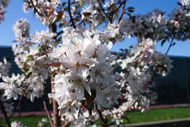
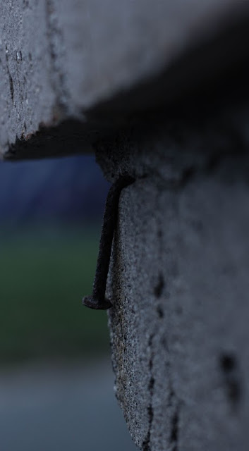
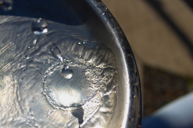
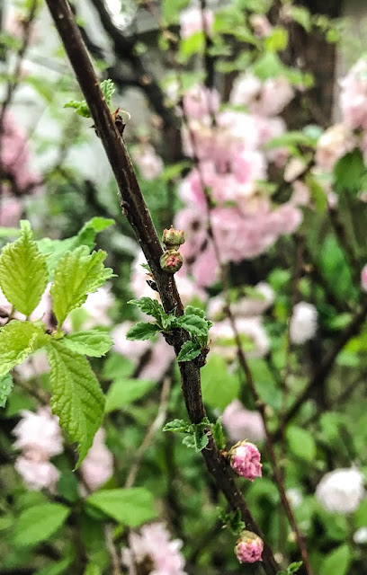
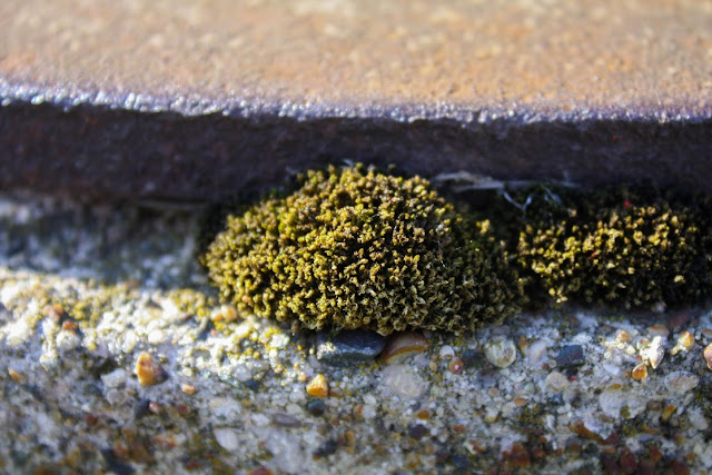
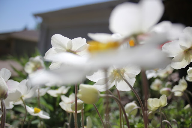
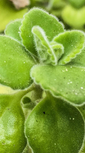
Enjoys some of my favorites from this assignment. 

Friday, May 18, 2018

Geometric Integration landscapes


So another Trend we did this year.... Geometric Landscapes. This may not be the best name but it works. 

Geometric designs are almost always on the top 10 design trends list because, it is my observation, that humans love to see the organization they bring to a photo. Shapes that can be created and calculated with a math equation let the human brain take a rest, and then coupling that concept with the creative elements of design, artist can get really cool images. 

I had taught this lesson last year, but there were a few things that I knew I needed to tweak to make it a more effective lesson, so I added a pre-assignment, where the students had to create three examples of original geometric design in illustrator, to help them practice for the final. I also added a section on geometric shapes and meaning. We watch the video below, that focused on the making of long lasting meaningful symbols. 


This video was a great conversation starter, because we talked about where they first learned the meaning of those symbols, and very few of them learning its meaning from school. It was eye opening to see something so important was taught to them by television. 


Here is the video I use to teach myself how to use the program for this technique.


Before they picked there picture though I wanted them to have a lot


The Assignment 1:
1. Create 3 geometric Shapes in Illustrator (only one of them can be used for your final)
       - I want them to start practicing what kind of meaning their shapes can represent in relation to the picture they chose.


Assignment part 2: They have to turn in two geometric landscapes. 1 can be more of a practice, but the other has to be clean cut and made with an intent.
1. Make you shape in illustrator
2. copy and past it into photo shop
3. Using the step from the video above copy and paste the different areas of the image into the geometric shape.
3. Adjust color in the shapes to add more depth and interest
4. Turn it in on google Classroom


Here are a few of the results!!