Thursday, November 14, 2024

Landscapes (Part 2) - Grey blocking

 We did part one, so students are starting to feel the "I can do this" vibe, so let's bring in composition and original ideas. 

Our second mini-lesson is one I started my Traditional drawing class with as well. This is a great sketchbook practice project that gets kids thinking originally without overthinking composition.  We build on the foreground middle ground background we started with in part one, we also apply the idea of aerial perspective, but now we're starting to think more about overlay, and proportion. 


Start with a piece of paper or a digital project 8x10 in 300 dpi. (this is a practice project so it does not need to be very large.) Split it into at least 4 parts. In my traditional drawing classes I often encourage more squares, and to fill as many as they can in a time decided time frame. 


Start with the foreground and make it black, then move into the middle ground and have it be dark grey, then do the background in light grey. The first iteration of this will make something very basic, but as students keep making them they realize they can add whatever they want and the black dark grey light grey becomes the color-blocking backdrop for more details. 


The result is a very satisfying sketchbook page and I have often had a student just clip one out of the project and use it as the sketch for their final assignment. 

Here are a few examples of what this looks like in the professional digital drawing space. 


Here is a video of instructions for the physical version of this thumbnail composition landscape exercise. 


Monday, November 11, 2024

Teaching font (My Mini Assignment)

 Teaching font can be an incredibly frustrating subject in design because it is tedious, and there are so many factors. Students need to practice intentionality, a skill most teenagers try very hard to avoid. 

So to get them ready for the "big" font assignment I start with two mini lessons that help Let them practice these things in Formative assessments. 

A couple videos I like for getting the message across. 


Mini assignment 1: Words on Pictures (dumb name bear with me)

This assignment has a very fast critique at the end of the assignment, I just read through all the images and decided if they were successful or not matching the text to the quote and the image. Some of them are pretty funny, but they soon realize that many of them didn't quite meet the requirements, so as a group we talk about the common problems we see and what we could do to fix them. 

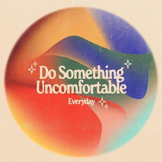
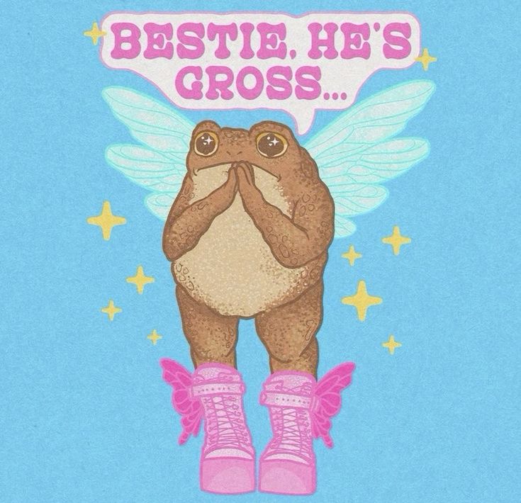
These are not student examples but they are examples I showed the students before we started. The kids then make their own versions. 

Requirements:
1. Choose a quote 
2. Choose an image
3. Choose a font from a website (cannot be one that is just available on Photoshop) 
4. Put them together with the correct color and size to fit the image the best they can. 


Mini Assignment 2: The calligraphr lesson (Not spelled incorrectly) 

Calligraphr is one of my favorite tools I found on the internet as of late and it beautifully and immediately shows students the anatomy of font. you can choose your template and what letters you want included you print your template and then you have the students make their very own font. It can be decorative or I also just let them make a font of their own handwriting. 

 Cralligraphr Website

 template example


Then I take their worksheet run them through the scanner, and share the google doc. they then find their font and we use the Calligraphr website to turn that final image into and actual text you can download and type with. 


These two lessons are quick and easy, keep them busy, and show instant results when preparing them for the final font design. They create a new font with a clear purpose and then use it in a scenario.