Monday, April 24, 2017

My Quick and Easy Guide to Black and White Photography


With the likes of Instagram available at our finger tips, we have gotten used to seeing black and white photography, but how do we make good Black and White Photography. I don't have all the answers, but hopefully these few tips will help boost you Black and white Photography game.

The following tips are just a few things that I have found make better photography. All the following tips are demonstrated in High School student work.

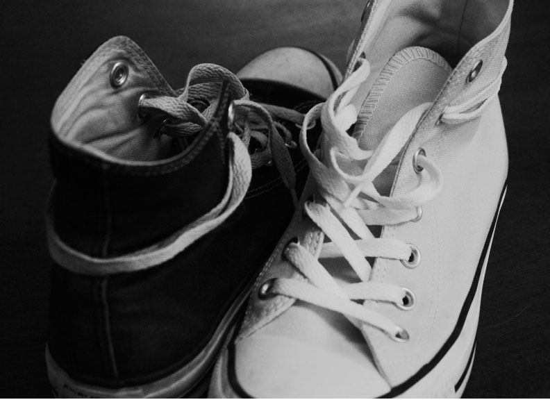
Tip 1: Try to find something visually interesting. If it was boring in color it will most likely not be improved much by going monochrome.


Tip 2: Find contrast.
- Contrast might be finding object that are all ready light and dark, or using shadows to create you dramatic colors.


Tip 3: Use Natural Light.
- Natural light is a no brainer and should be used as much as possible in any style of photography, but the quality of light really shines through in black and white photography.


Tip 4: Look for Texture:
- Avoid front lit texture, because that is pretty pointless, however other texture create interest in you photos.


Tip 5: Look for patterns
- This could be brick, structures, threaded, or even a repeating texture. Pattern adds interests and makes the eyes happy.


Tip 6: Pay attention to interesting shapes and lines.
- Shapes are great, especially when you can find odd ones. Look around your area, are their any funny windows, or statures with holes, or even stairwells you can see down or under.
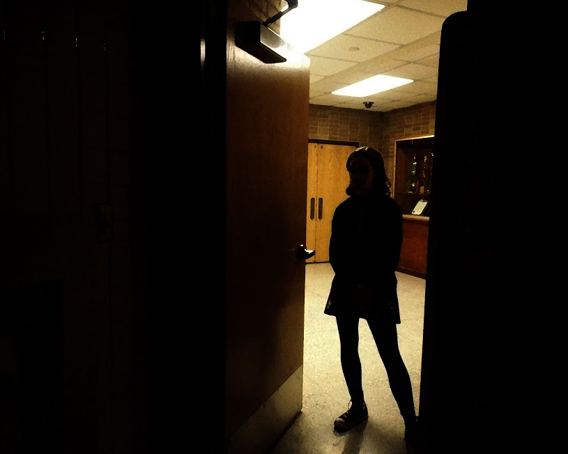


Tip 7: Shadows
- Any day you can use a shadow is a good day! Find ways to make shapes with your shadows, find the golden hour and play with the shadows that the low sun creates. (Link to a golden hour calculator http://www.golden-hour.com/)


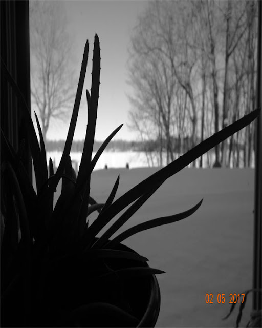
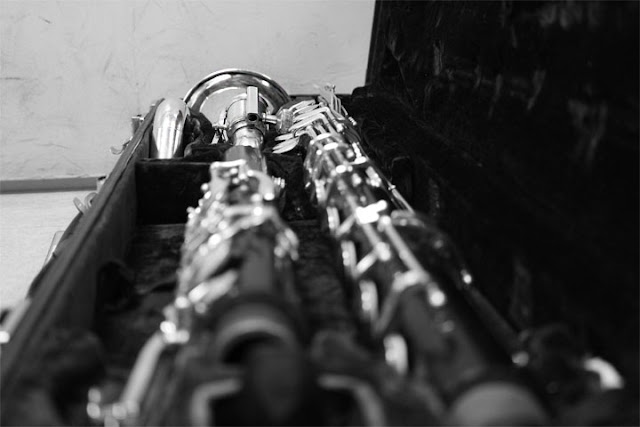
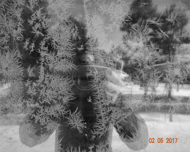
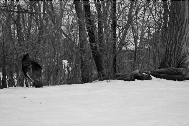
Here are a few other Photos worth showing from our Black and White Unit.


I hope you enjoyed! If you want to stay in the look don't forget to Follow the blog before you leave.

Great Video To Help Your Students Up Their Photo Game


Taking photos can be hard, and thinking of all the rules that go along with them can even be harder. Here is easy to understand video with some of the best tips for improving your photography. 


Friday, April 21, 2017

Geometric Modernism with High School

In my High school level Digital Art and Photography class we Learned about trends in graphic design. The beauty of being a graphic designer is that you will never be doing the same thing. Even f you work for the same company doing a similar tasks, the nature of aesthetics is change and trend.

Every Graphic design should be in a constant state of flexibility and learning; they need to research current interests and media to keep up with the needs of their clients.

Below is a little colorful diagram borrowed from https://venngage.com/blog/graphic-design-trends/.


This is great time to have student reflect back on the past year, and what is expected to change with the coming year. You might learn something from your students, that they have seen in current social media trends that may have slipped past you unnoticed. 


Skills it teaches: 

- Learning the communication between Illustrator and PhotoShop by creating a shape in illustrator and bringing it into PhotoShop
- Understanding the what aesthetic elements go into creating a successful geometric design
- Using the Wand, Copy, Paste, tools as well as layer naming. (It is hard to even convince professional artists to name their Layers, this project has serious consciences for not doing so.)


We focused on the Authentic photos, and minimalism with Geometric design meshed with photos. The students had to create their own Geometric creation in Illustrator then copied it into PhotoShop.


Here is the video that I put on the google classroom, after I taught the lesson so students could have something to look back to for help on the steps. 


And here are some examples of final work created by my incredible HIgh school students. 


Wednesday, April 19, 2017

Training your Photography Eye: Silhouettes


Some times getting Middle school to challenge their photographic eye is about easy as trying to teach a horse to tie shoes. Because lets be honest Middle Schools are the best at everything...

**Jokes**

To be fair, Middle School is the generation of technology they have now been raised partially by the internet, and they have a lot of experience with recording devises. **Cough Cough I hate snap chat Cough** They record  and take picture of everything they do and say, so when you tell them we will be learning about photography they have probably take more picture than you have in their life. However, take lots of picture does not always mean they know how to take good pictures.

So for this assignment we focus on lighting, and controlling light. Instead of focusing on light in the broad sense, we are narrowing our technique to backlighting.

The students are sent off with the camera and a mission to control the lighting, so all the subject show up as silhouettes. It takes trial and error, a few misfires, and a lot of lamps, so in the end we get a great experience and some amazing photos.

All photos were taken by 7th grade students


Wednesday, April 12, 2017

Soft Editing Versus Hard Editing(Featuring Middle School Photography)

There are two phrases I like to make clear to my student especially the younger grades, and that is Hard Editing Vs. Soft Editing. 

Now I want to make it clear to you, the reader, that these terms may not be the standard terminology, however it is the verbiage I use to make my expectations for the students clear in my classroom, and on their assignments.

Hard Editing is when you add eliminates to the photo that completely changes the picture, defies the laws of physics, or adds an element that could not possible exist. Examples of this would be Adding space to the sky, or adding an animal that was not there originally. Below is an example of  hard Edit photo graphed and edited by a 7th grade student. 

Soft Editing is where you don't the image with only the pixel you have available to you. You don't add any images to the picture, the only thing you adjust is the lighting contrast and saturation. Below is an example of what that would look like, taken and edited by a 7th grade student. 

Here are a few more examples of Hard Edits:


More examples of Soft Edits:


This was all done by 7th and 8th graders. Aren't they Mindblowingly amazing fantastic!?

Don't forget to follow the blog to see more examples. 

Monday, April 10, 2017

Re-Cut Trailers

My students have a lot of opportunities to make Movie as a group.  Mainly for the convenience; it is hard for high schoolers to organized their friends all the time for videos. However, through the natural order of organization, students who are better at editing always end up as the editors. So I came up with a way for all the students to get editing experience in HitFilm4 express. 

The Assignment focuses on tone in movies and their respective trailers, and how music, lighting, and well times cuts and change the tone of a movie dramatically. 

The student were required to pick a movie, and create a trailer that is the opposite of its original genre. For example: Mary Poppins as a Horror film, or Saw as a comedy. 

Here are a few examples of student work. 

Up as a Thriller


Bobs Burgers as a Cannibal Horror Flick

Lilo and Stitch as a Horror