With a title as catching as that, what more do I have to say. Just kidding.
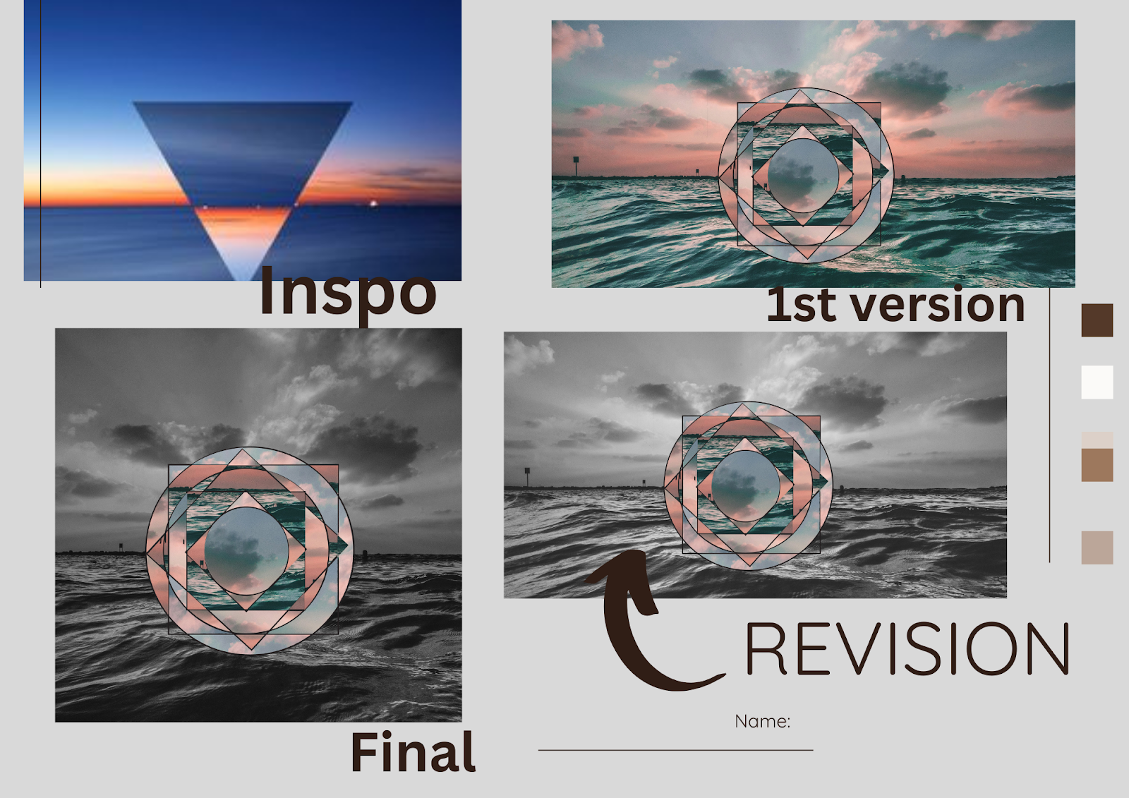
This is a project, I believe, I have written about in the past. However, I have made a few changes that I think have resulted in more meaningful results and made for a more enjoyable making process. The big change I made was the revision piece. AP requires that you show a revision and transformation. I created a revision template that students can edit. The template helps students to start the editing process and how to show evidence of transformation when talking about their work.
This is a project where I like to focus on the meaning of shapes. We learn about the history of language and how shapes have influenced everything from the meaning of signs we use for driving, to informational tabs on our computers and students
I like this video because it talks bout how shape and meaning can be used in a very tangible way. I love also how weird it is. It creates a great conversation around function and imagination.
Video of the fractile process in Photoshop
Link to the Canva revsion board https://www.canva.com/design/DAGgNwqPppU/wLYRr5Q6lJuaZt0Y9fEdnw/view?utm_content=DAGgNwqPppU&utm_campaign=designshare&utm_medium=link&utm_source=publishsharelink&mode=preview
My revision example